Returning to the Derwentwater Print
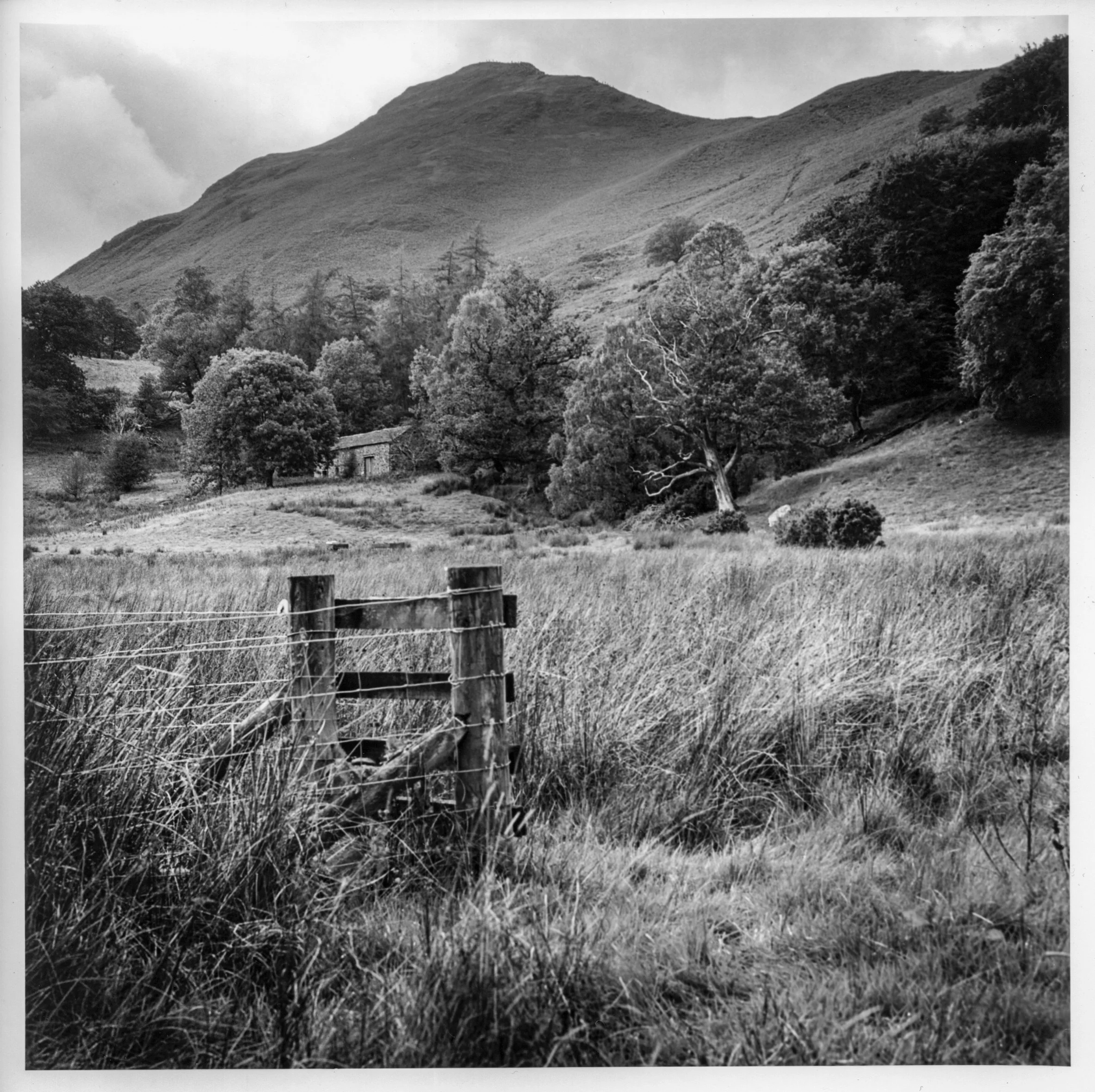
Returning to the Print
At the end of last week’s blog, I said I might tone my Derwentwater print with sepia and selenium. I wanted to spend some time with it first, so I placed it beside my desk, where I could look at it while working. After a week, I had become fairly certain that it needed more work before I considered toning. It was too dark, but there was also a muddy quality to it that became more obvious the longer I looked. The grasses, trees and hillside contained detail, yet the print wasn’t giving them the separation I wanted.
That was a different judgement from the one I had reached at the end of the printing session. I had made four full-size versions, compared them as they hung to dry, and felt happy with the fourth. The clouds had the presence I wanted, and I thought the additional exposures had brought the different parts of the landscape together. Beside my desk, though, I gradually became less interested in what I had done to make the print and more aware of how it actually looked.
It had been a grey, cloudy day when I made the photograph on the walk from Low Brandelhow to Hawes End. Some of the subdued appearance seemed consistent with that, but I couldn’t quite account for the heaviness of the result. I had used fresh chemicals to develop the paper, so exhausted developer wasn’t an obvious explanation. I kept looking at the foreground and the trees, feeling that there ought to be more distinction between them than I had managed to put on the sheet.
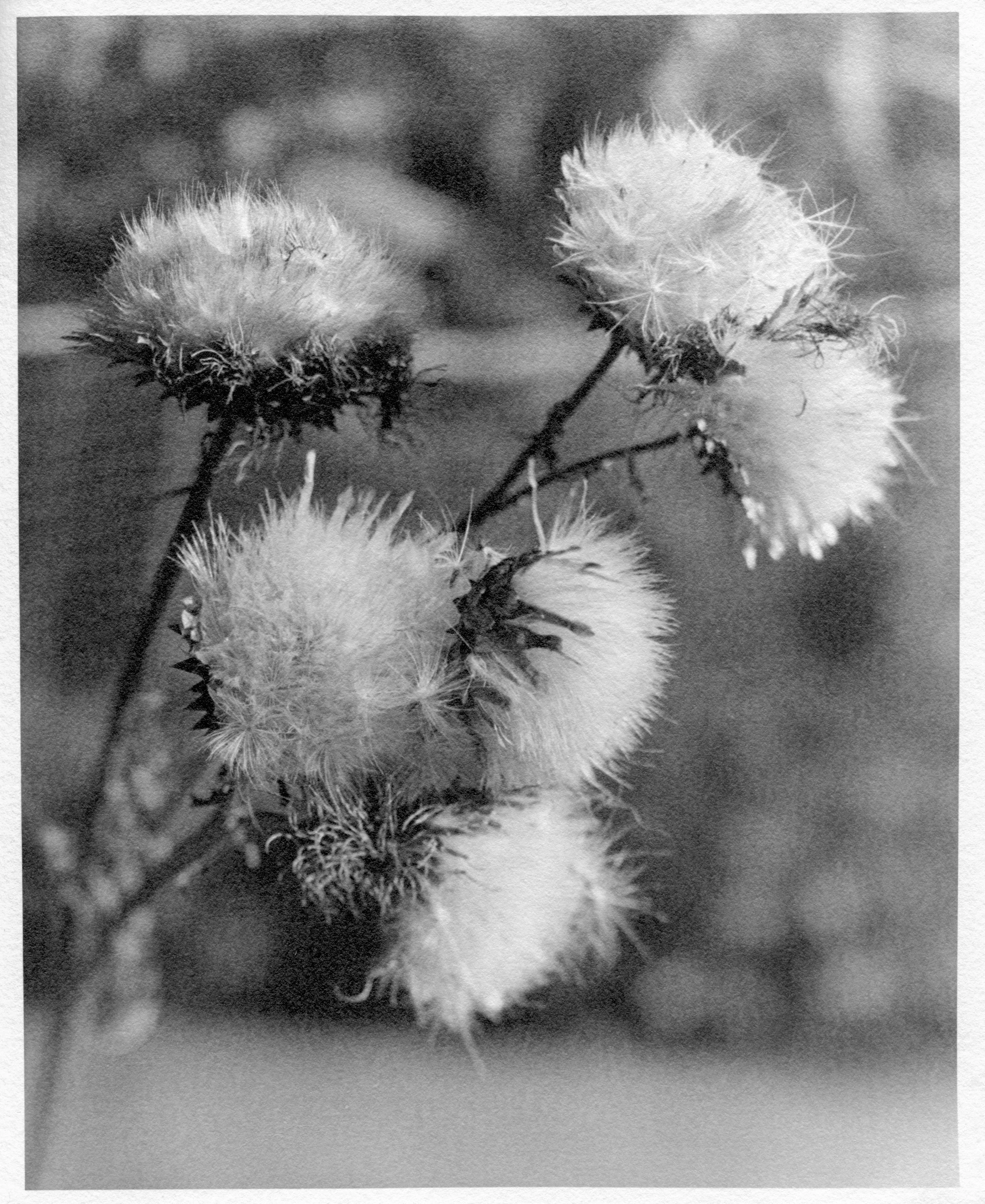
I wasn’t yet sure whether I needed to change my printing decisions or look elsewhere in the process. What finally made me return to the photograph was a 4×5 negative of some seed heads, made at the weekend and printed on a different enlarger.
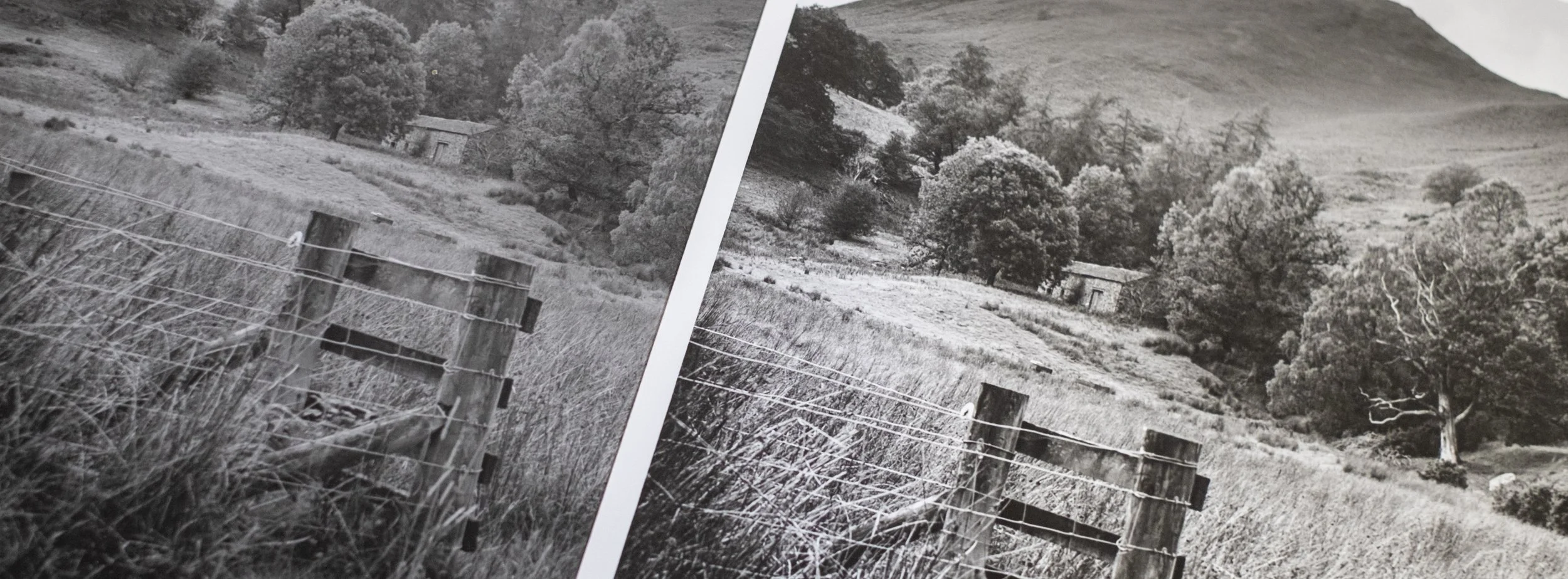
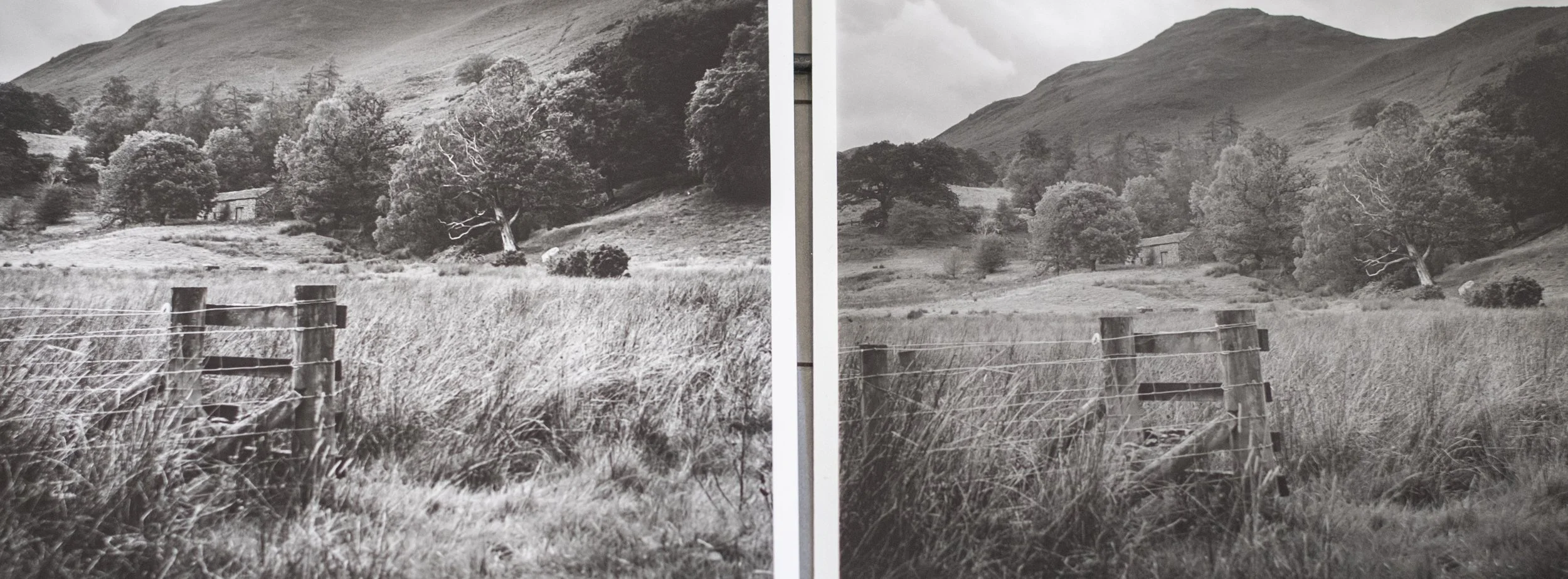
The two Derwentwater prints side by side
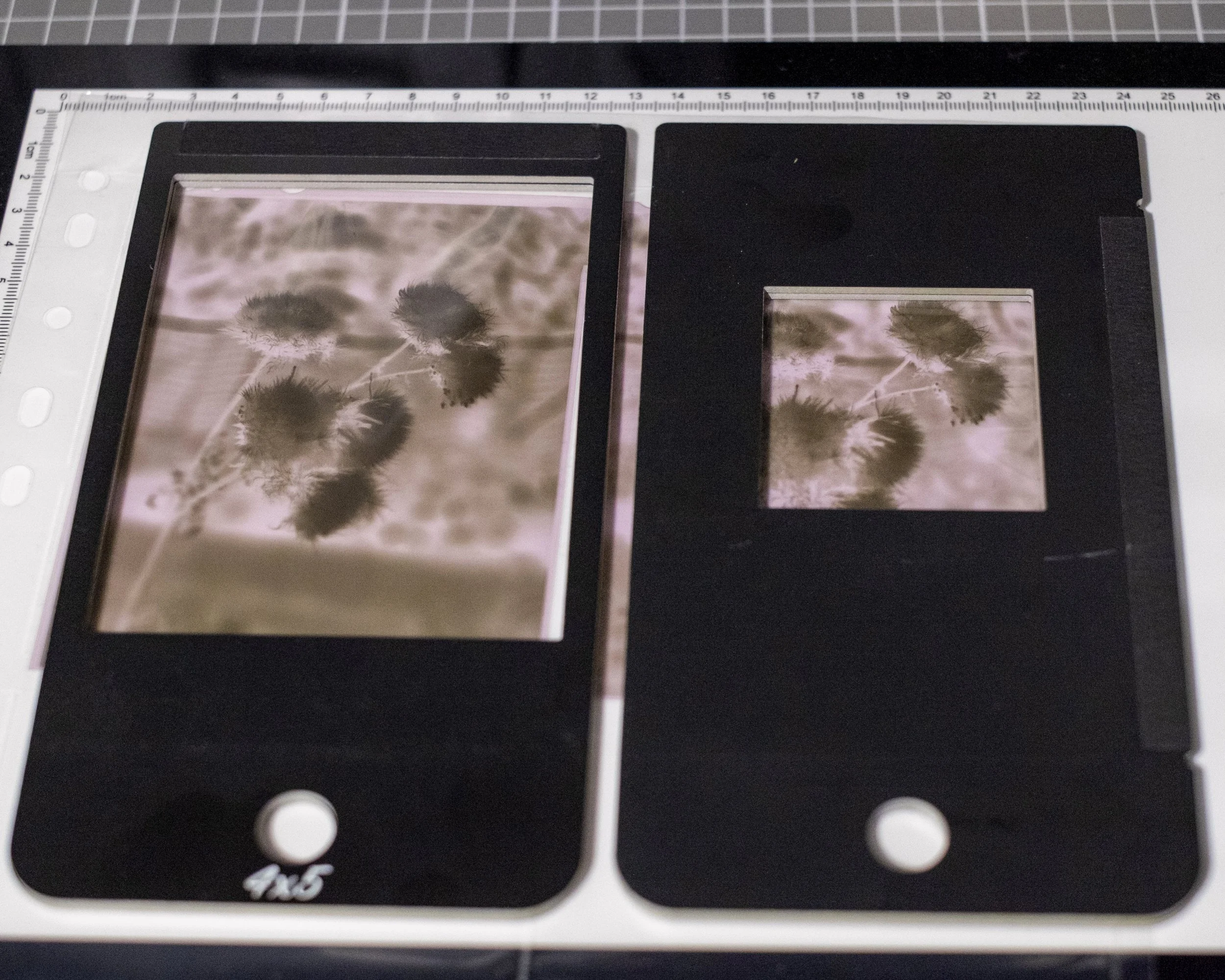
A different negative under the Intrepid
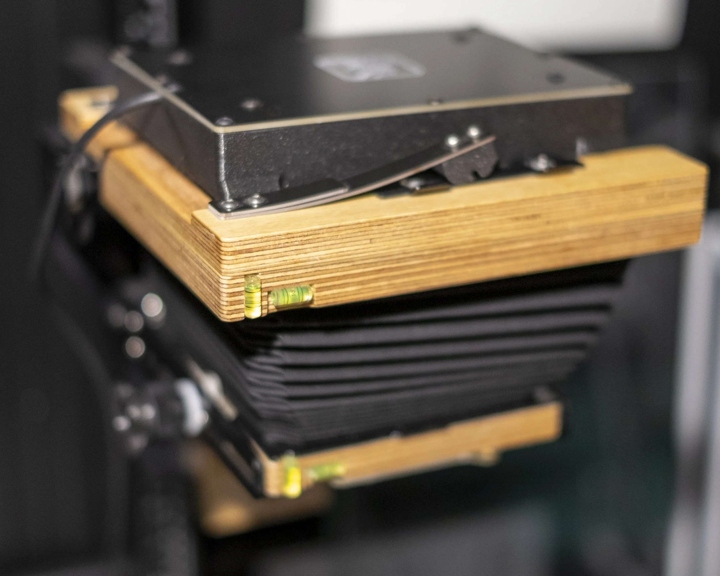
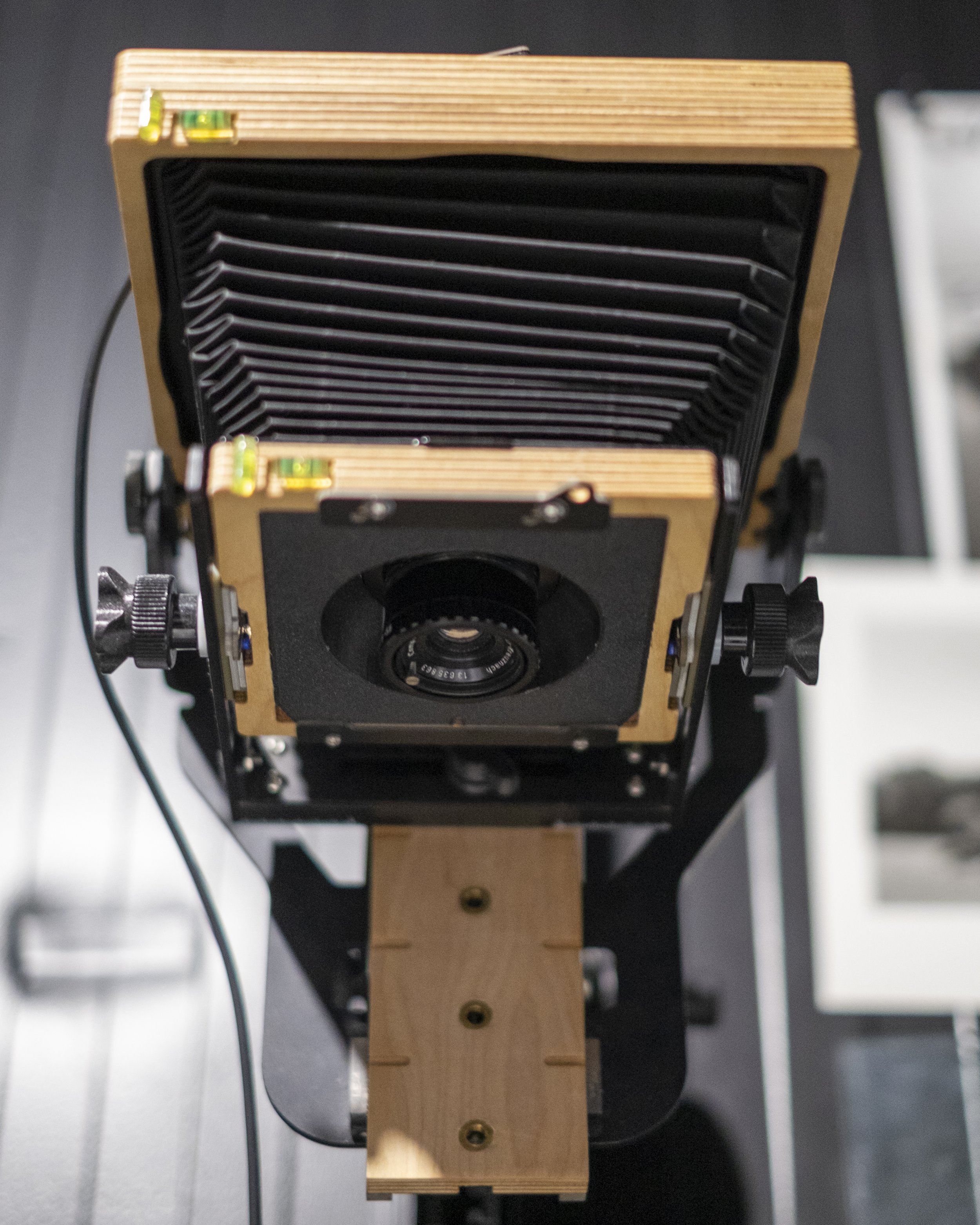
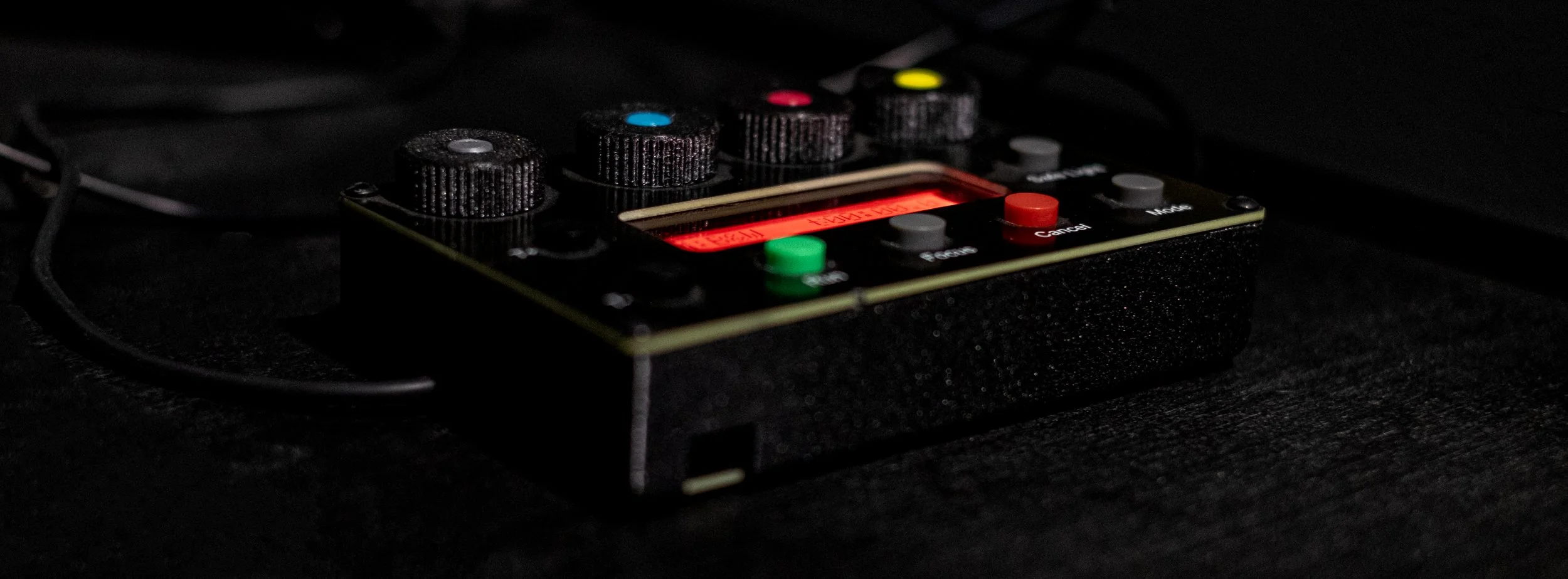
For the seed heads, I used the Intrepid enlarger attachment that fits onto my Intrepid 4×5 camera. This is the setup I normally use for large-format negatives, while the Durst M605 is my dedicated enlarger for medium format. The Intrepid requires a different arrangement, but it lets me use the camera for printing as well as making the negatives.
I had taken the enlarging lens from the Durst to use on the Intrepid. That became useful when I started looking at the results, because the lens was one part of the setup that hadn’t changed. Straight from the test strip, I could see that I was getting a punchier image. After spending a week looking at the Derwentwater print, the difference was enough to make me question whether I had been accepting a result from the Durst that I shouldn’t have been satisfied with.
The seed heads are a different subject, on a different negative, so they couldn’t tell me exactly what was happening with the landscape. They did give me a reason to try it through the Intrepid. I had been thinking about the Derwentwater print in terms of its exposure and the weather when I took it. Seeing a stronger result from this setup made me want to find out what it could do with one of the negatives from that same walk.
That is one useful consequence of moving between formats. I tend to think of the two enlargers as having separate jobs, and usually choose between them according to the size of the negative. This time, working on a large-format photograph led me back to a medium-format print I had thought was nearly finished.
Choosing the preceding frame
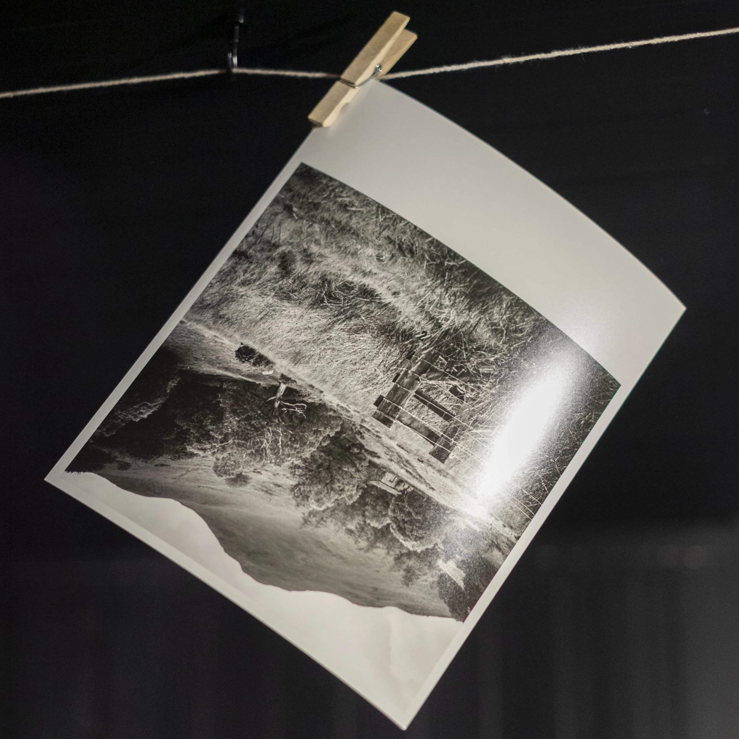
For the new print, I chose the frame immediately before the one I worked on last week. It shows the same scene, but includes less sky. Alongside trying the Intrepid, I wanted to see whether reducing the bright area at the top would anchor the photograph more firmly in the landscape below it.
Last week, I wrote about the farm building as something small and human within the larger scene. That still interests me. It sits among the trees rather than announcing itself as the subject, with the fence and long grass in front and the hillside rising behind. I wanted the print to make those relationships clearer without making the building unnaturally prominent.
I think the frame with less sky works better. There is still enough cloud above the hillside to retain a sense of the weather, but the upper part of the photograph takes up less of my attention. The fence feels more firmly placed in the foreground, and my eye moves from there into the trees and towards the building. The mountain remains a substantial part of the picture without needing quite so much space above it.
It is a small compositional difference, but looking at the complete prints makes it easier to judge than switching between scans. I had spent a good deal of the first session trying to give the sky more presence. Returning to the negatives made me consider whether I preferred a frame in which it occupied less space to begin with.
Choosing another frame also means that the finished prints aren’t a straightforward test of the two enlargers. I changed the composition as well as the printing setup, and went on to use different contrast settings. The comparison is useful for deciding which print I prefer, but it doesn’t isolate the reason for every improvement.
Separating the sky from the landscape
The first print had started with a contrast setting of 3.5 and a ten-second base exposure on Ilford Multigrade Pearl RC paper. I then gave the sky and hills an additional twenty seconds, the foreground another ten seconds, and added a five-second vignette. Those decisions gave me the fourth version I described last week, but living with it made me reconsider the overall weight of the result.
For this version, I used split-grade printing for the sky, combining grades 00 and 5, while using grade 5 for the main landscape. I wanted to keep the detail in the clouds and give the trees, fence and grasses the stronger separation that had been missing. Treating the sky differently let me work on those parts of the photograph without expecting one contrast setting to suit the entire image.
The improvement was apparent from the tests, but I still needed the full print to judge whether the different treatments belonged together. Last week’s session had already shown me how much the balance could change when I added exposure to one area. A stronger foreground could help the fence and grasses, but it also had to sit comfortably beneath the softer hillside and cloud.
In the finished version, the blacks and whites give the photograph a much clearer structure. The fence has more weight, the light grasses stand apart from the darker areas around them, and the trees are easier to distinguish from one another. There is more to look through in the middle of the photograph because those details no longer seem quite so absorbed into a general grey tone.
The print also feels sharper. That is partly an impression created by the increased contrast: the edges and textures are more clearly described, so the whole photograph appears more definite. It has a cleaner, more modern feel than the previous version. The muddy quality that had been bothering me is greatly reduced, and the balance between the foreground, trees, hillside and sky feels much better.
Looking again at the Durst
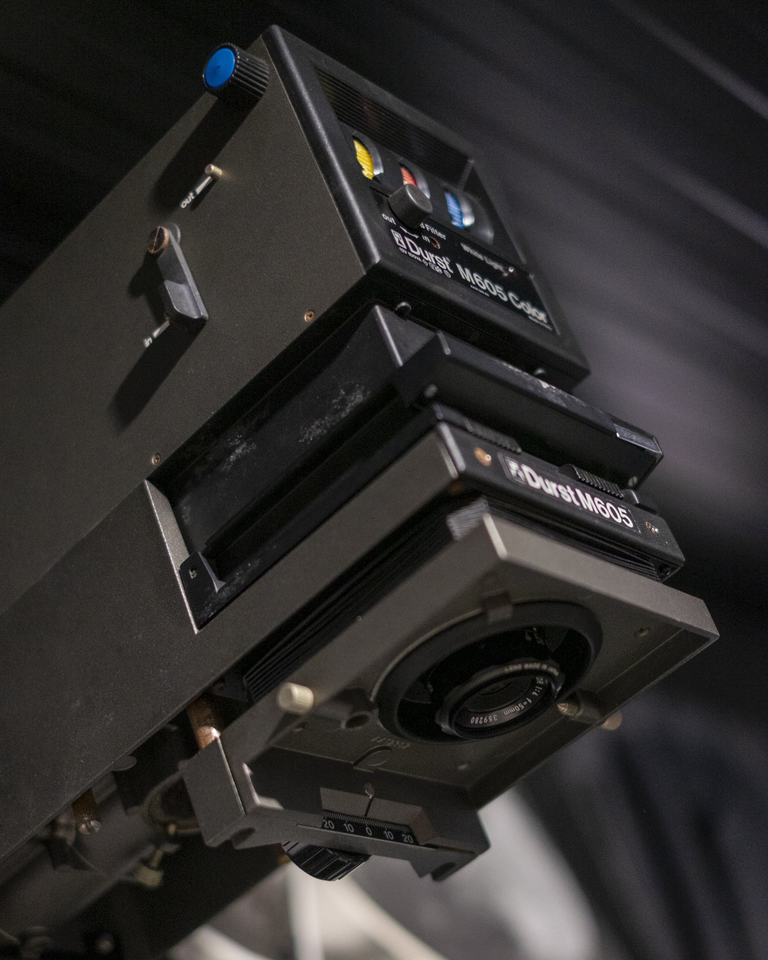
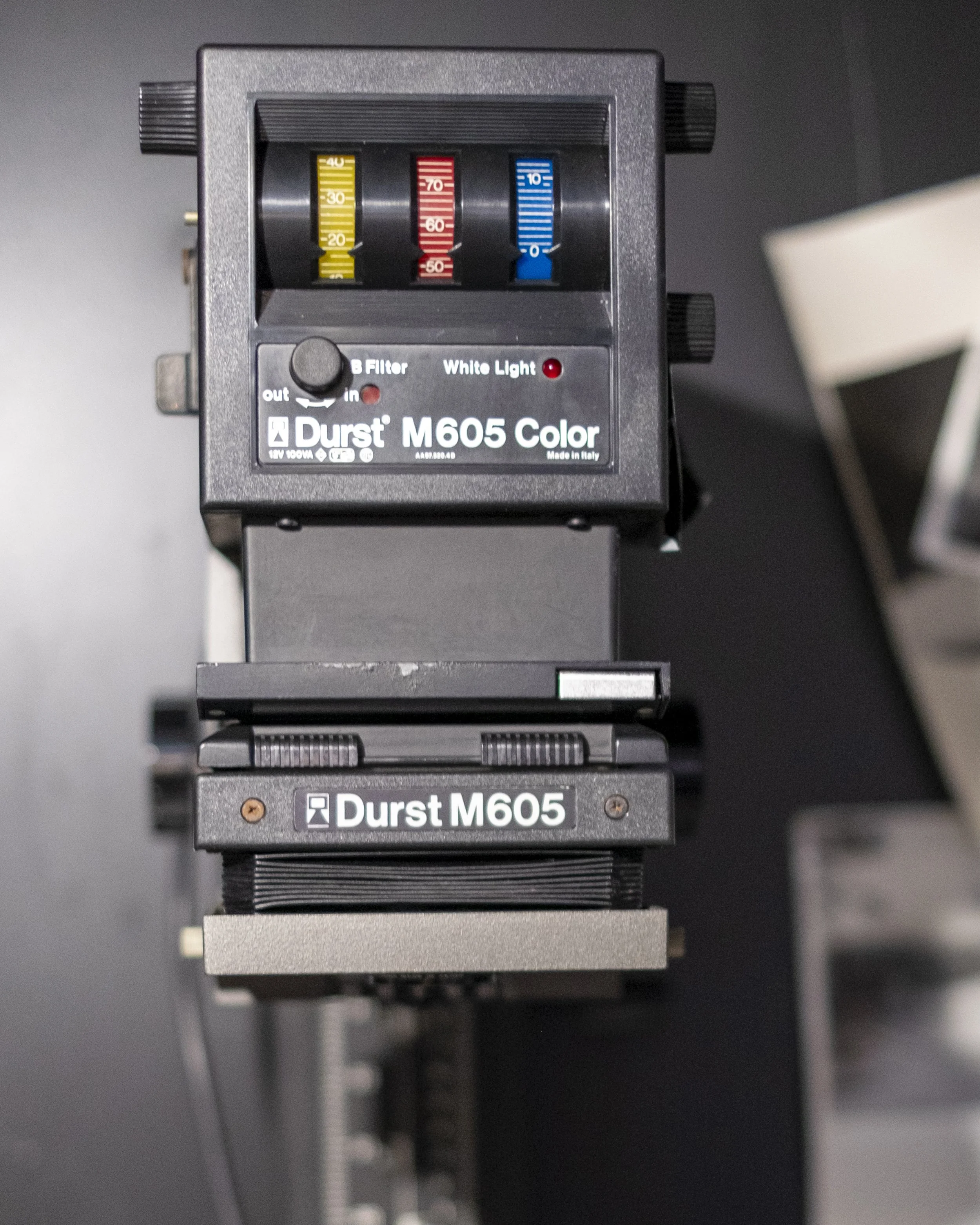
Seeing the results has made me think about a change I made to the Durst around six months ago, when I replaced its bulb. I can’t help wondering whether the replacement is contributing to the prints I’ve been getting. I had continued using the enlarger as my normal medium-format setup, but the difference with the Intrepid has given me a reason to examine it more closely.
I haven’t established that the bulb is the cause. The two landscape prints use different frames and different contrast treatments, while the seed-head photograph comes from a larger negative altogether. There are several things involved in the comparison. Even so, the fact that I used the same enlarging lens makes the light source something I want to investigate rather than simply assume is working as expected.
The Durst is the enlarger I would prefer to keep using for 6×6. It is set up for that work, and I find it more convenient than adapting the Intrepid each time. With the Intrepid, I have to gently tape the medium-format negative into the film holder, then make some slightly awkward sideways adjustments to the camera to centre the projection. It is workable, but it requires more care and fiddling than the M605.
That practical difference is why I have tended to reserve the Intrepid for large format. The Durst makes it easier to begin printing a medium-format negative, and I would like to get back to using it with confidence. After looking at these prints side by side, however, convenience isn’t enough to settle which setup I use. I want to understand why I have been happier with the results from the Intrepid before returning to the same routine.
Giving the second print some time
This has changed what I intended to do next with the photograph. I had thought the remaining decision was whether sepia and selenium would suit the print. A week beside my desk showed me that I needed to revisit the printing first. I’m pleased I waited, because I now have a version in which the detail and tonal balance are much closer to what I wanted from the negative.
The composition has also moved on slightly. Last week, I wondered what a longer lens or a different position might do with the building and hillside if I returned to that stretch of path. Those are still photographs I would like to explore, but looking at the preceding frame has reminded me to spend more time with the alternatives I already have. Less sky has helped this version without changing the quiet place of the building among the trees.
I also wondered whether my choice of film developer had contributed to the muddy appearance. As I mentioned last week, I developed these negatives in 510 Pyro, a staining developer, and that was another part of the process I had begun to question. The second print has reassured me that these negatives can produce the separation and stronger blacks and whites I wanted. Whatever influence the developer may have had, the first print clearly wasn’t the limit of what I could get from the film.
The new print will take the place of the first one beside my desk. At the moment, I think it looks fantastic, but I want to give it the same opportunity to become familiar before deciding what to do next. I also have a bulb to investigate. What began as a possible toning session has turned into another print of the landscape and a closer look at the equipment I use to make it.