Low Cloud over Derwent Isle
Returning to a 2021 Negative
I haven’t taken much on film that I want to print recently. Taking digital cameras to Italy gave me plenty of photographs to work through, but nothing to put directly into the enlarger. I could make digital negatives from those files, and that remains something I can return to, but this time I wanted to go into the darkroom and print without the preparation that would involve. With the darker nights drawing in, I have been more inclined to spend time there, even without a newly developed roll waiting for me.
That brought me back to a photograph of Derwent Isle, taken from Crow Park in 2021 with my Canon EOS-1 and Lomography Fantôme 8. I have made plenty of photographs from this vantage point over the years. The island, the posts in the water and the hills beyond are familiar subjects, but the low cloud in this frame makes it one of my favourites. Cat Bells is partly obscured behind the island, with just enough of the hillside visible to suggest what continues beyond the trees.
I already have a larger print of the following frame on my office wall. I made that print in 2021, so this was a return to a photograph I have spent several years looking at, as well as to an older set of negatives. For this session, I chose the preceding frame and made a smaller, 6×9-inch print. The main difficulty was familiar from the earlier version: the island needs very little exposure compared with the bright clouds and water surrounding it.
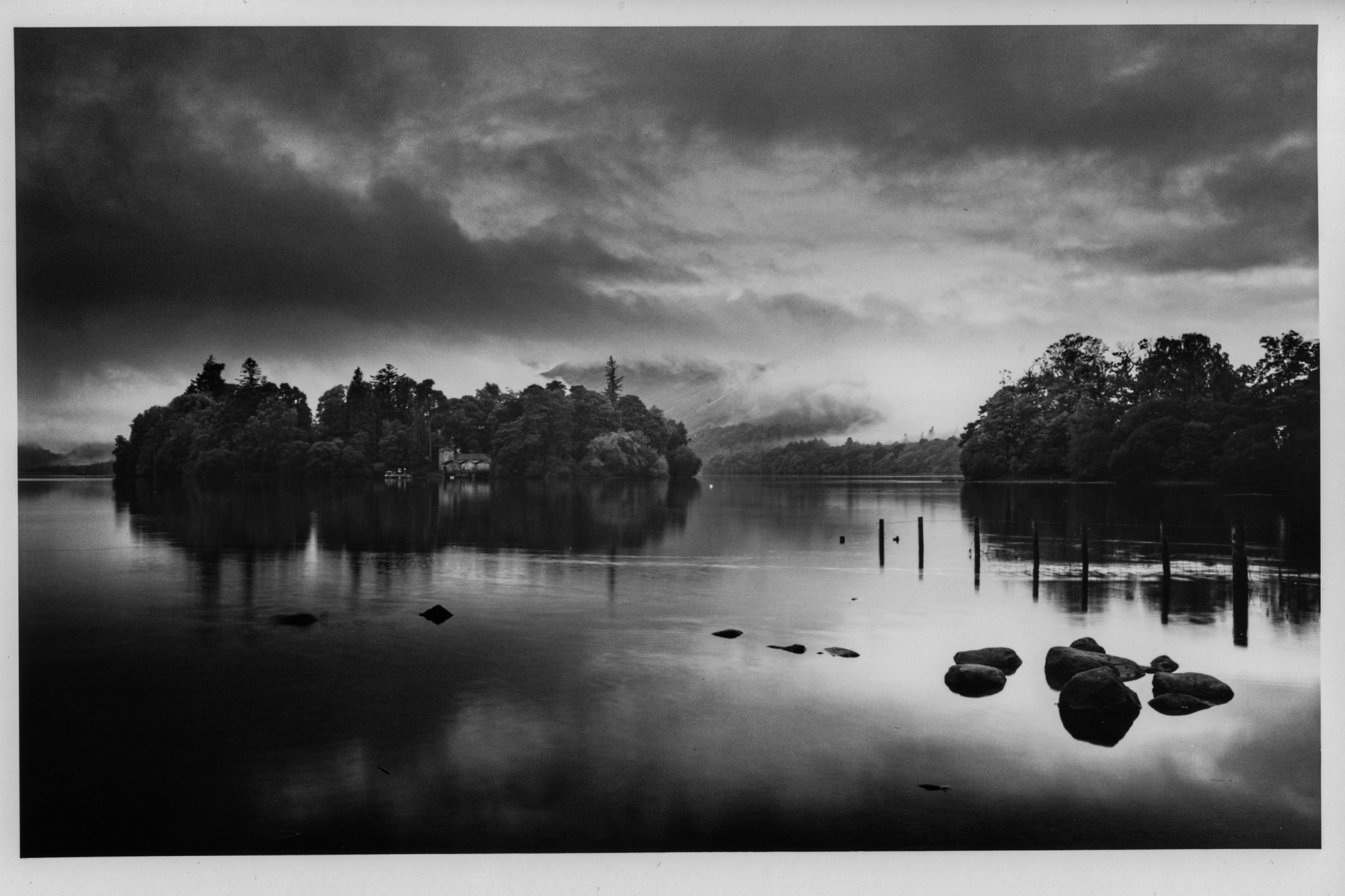
Derwent Isle from Crow Park
A familiar view in different weather
There are views I continue to photograph despite already having several versions of them. This is one of those. Standing at Crow Park, I am usually drawn to much the same arrangement: Derwent Isle across the water, the boathouse among the trees, and the hills behind. The foreground rocks and posts give me something nearer to work with, while the weather determines how much of the distance is visible.
In this photograph, the low cloud changes the relationship between the island and Cat Bells. The trees form a fairly definite shape across the middle, but the hillside behind them appears and disappears into the cloud. There is enough separation to see that the landscape continues beyond the island, without the mountain becoming a clearly described backdrop. That uncertainty is a large part of why I prefer this frame to many of my other photographs from the same position.
The boathouse and jetty matter to me as well. They are small within the photograph, but they give the eye somewhere to settle among the trees. In the recent Derwentwater prints, I was interested in the farm building partly hidden in the landscape. Here, the boathouse has a similar appeal. I want it to remain part of its surroundings, but I also want enough detail for it to be found.
That becomes difficult when printing. The cloud and its reflection occupy most of the photograph, yet the narrow band containing the island needs a very different treatment. Giving the larger, brighter areas enough exposure can easily cost me the details that interest me in the middle.
Five seconds and more than a minute
For this print, I gave the whole image five seconds at contrast 5. That exposure provided the treatment I wanted for the strip through the middle, including the island. The clouds and water needed much more work, with exposures of over a minute at contrast 0.
Those are very different demands within one photograph. The five-second exposure goes across the entire sheet, but the longer exposures have to be directed into the brighter areas while keeping them away from the island. I need enough exposure to bring out the cloud and give the water some weight, without allowing the trees, boathouse and jetty to become too dark.
Written down, the division sounds reasonably simple: a short, high-contrast exposure for the whole image, followed by much longer, low-contrast work on the sky and water. Under the enlarger, the difficulty is in the boundaries. The island is surrounded by the areas that need the additional light, and its outline is far from a convenient straight edge.
The tops of the trees break into the sky at different heights. Below them, the shoreline and reflections make another transition that needs to feel natural. Too much protection can leave an obvious light area around the island. Let the extra exposure stray too far into it, and the detail begins to disappear. The aim is to make a substantial difference to the exposure without making that intervention conspicuous in the finished photograph.
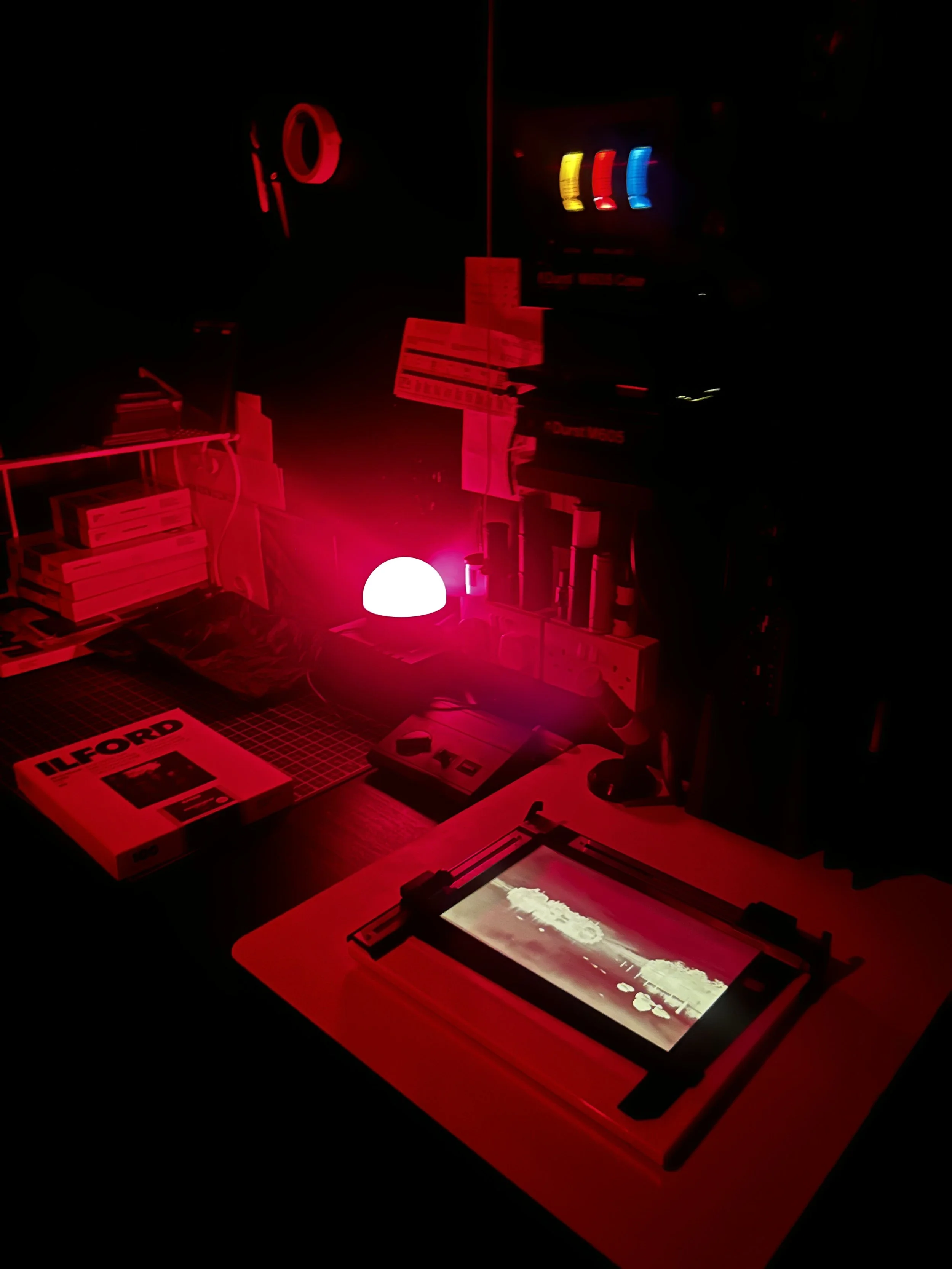
Working under the enlarge
A minute also feels considerably longer when I am controlling where the light falls than it does when I am simply waiting for a timer. The exposure has to remain useful across the area being burned in, with enough movement to avoid a hard boundary. I am thinking about the clouds, the edge of the trees and the eventual balance of the print at the same time.
The water presents a similar problem below the island. It needs enough tone to sit comfortably beneath the sky, but I don’t want to lose the distinction between the reflections and the surrounding surface. The posts and rocks are already strong shapes. Darkening everything around them too much would change the foreground considerably, even if it helped bring another part of the water under control.
This is where dodging and burning becomes more demanding than the exposure times suggest. I can record which areas need more light and at what contrast, but carrying that out consistently by hand is another matter. Small differences in where I hold back or add exposure can affect the boathouse, the trees or the brightness around the island. At 6×9 inches, those details occupy quite a small part of the sheet.
Comparing it with the print on the wall
The larger print in my office was made from the following frame, with a similar printing map. It has been on the wall since 2021, and I still like the way the clouds look in it. They have the presence that attracted me to the scene, and the low weather remains the first thing I notice when I look across at it.
The island, however, is very dark. That gives it a strong outline against the cloud and water, but it also makes the trees and the small buildings harder to read. Having lived with that version for several years, I was interested in whether I could retain more in those areas this time.
I think the exposure on the boathouse and jetty is better in the new print. They are easier to distinguish without becoming overly prominent, and the island contains more to look at. It still has enough darkness to hold its place across the middle of the photograph, but it feels less like a single mass beneath the clouds.
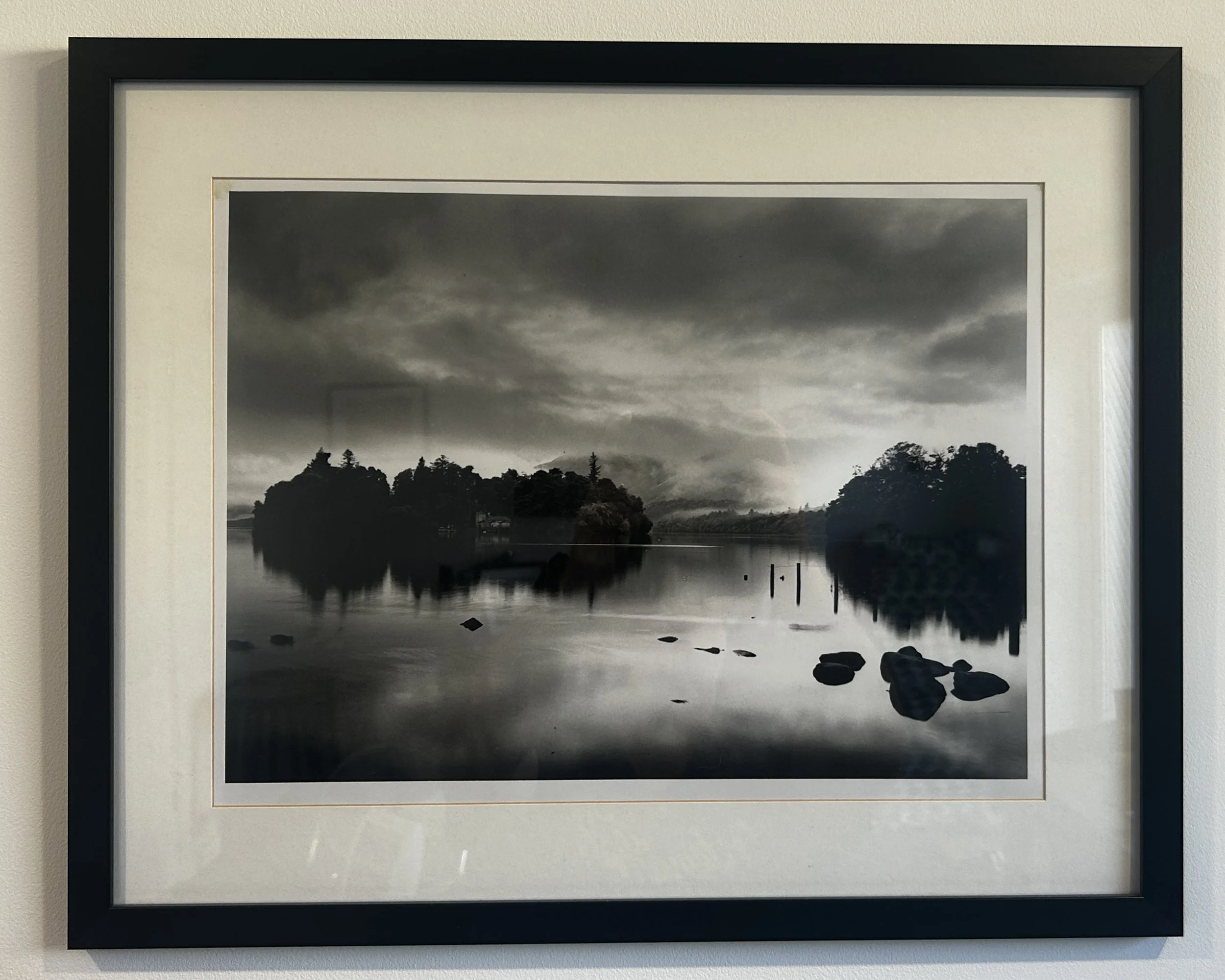
The larger print made in 2021, on the office wall
The new version isn’t perfect. Getting the clouds, water and island to sit together remains difficult, and I don’t think every part of this print is necessarily better than the one on the wall. I like the clouds in the older version, while preferring how the boathouse and jetty have come through in this one. They are also different frames, printed at different sizes, so there is more involved than a change in exposure alone.
That makes the comparison more useful than simply deciding which one wins. The older print gives me something familiar against which to judge the new attempt. I can see where I have improved something that had bothered me, while recognising that another part of the earlier print still works well. Making this smaller version doesn’t mean I need to take the larger one down.
Older negatives for darker days
I have plenty of prints already. There are boxes of them in drawers because I have run out of wall space, and another printing session is unlikely to solve that particular problem. Even so, finding somewhere to hang the result isn’t the only reason I want to make it. I enjoy working through the negative, deciding what needs attention and seeing how those decisions appear on paper.
At this time of year, that becomes a more appealing way to spend an evening, or dark wet afternoon. Without new film to work on, it would be easy to put off going into the darkroom until I had photographed something else. Looking back through older negatives gives me a reason to begin now, and there is usually more there than I remember.
Some frames have never been printed. Others, like this one, belong to a sequence I have already worked on but can approach again with a particular change in mind. Having a print on the wall doesn’t mean I have exhausted the negatives around it, or even settled every decision about the one I chose at the time.
There is also the pleasure of returning to the place through the photograph. This negative takes me back to Crow Park and the view across to Derwent Isle, with Cat Bells disappearing into the low cloud. I have photographed it many times, but this weather is why I wanted to print this frame again. For a dark, wet afternoon when I had nothing new to put in the enlarger, a negative from 2021 gave me quite enough to work on.